Update: November 15: St. Mary’s site is restored
See this post for related coverage.
Update: November 14, 2008, 10:37 PM ET.
The St. Mary’s of Greenville site is unavailable as I write this so many of you are coming here looking for more information. Try these links:
- AP Story: SC priest: No communion for Obama supporters (AP story)
- Fr. Newman’s letter to parishioners (from the Google cache/last snapshot of site before it went down)
I’m guessing St. Mary’s site is unavailable due to a surge in traffic, but I have not yet heard back from one of my webmaster contacts there.
Thank you–Mark
[Update from Nov. 15, 2008: Port 80 was closed intentionally to give time for the Diocese to regroup.]
OK, back to the original review from January of 2007…
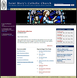
You don’t have to wonder this month why St. Mary’s of Greenville, South Carolina is American Catholic’s website of the month. One look at this site’s beautiful layout and gorgeous pictures will inspire you to explore the clearly displayed main content areas and to read the fresh news. Let’s take a closer look at the many elements of church site design St. Mary’s does right that you may want to try on your own site.
- Weekly message from the clergy — the site highlights the weekly pastor’s column from the bulletin so that a new and topical message is ready each week. He’s writing it anyway so getting double duty is a great idea.
- Clear links and main sections across the top — First time visitors can immediately orient themselves finding essentials including location, directions, bulletins and ministries. Established parishioners can easily get to what they need. And all visitors will enjoy seeing the most popular pages listed on homepage. A little overuse of my browser’s reload button reveals that the count of page visits is indeed updated on the fly (although “views” looks to be a more accurate description than “visits”).Traffic-ranked content is an effective way to keep the home page new because the counts automatically update and I’ll assume there’s some variety over time. Recommended picks are also prominently displayed for those who appreciate editorial guidance–a good way to promote the inevitable pages that aren’t (yet) popular, but are important to someone on staff.
- Rich, professional quality pictures rotated on the home page — which also appear throughout the site. These aren’t the snapshots or mug shots you often encounter in these neighborhoods. One gripe: only two of the 13 home page photos (#7 and #10) are people pictures, with #7 reflecting an overhead shot when the church looked pretty empty; pick one of your more crowded days, instead, since nothing attracts a crowd like a crowd.
- Audio versions of homilies — choose from streaming, for listening while on the site, or download as MP3s for listening on the go. Adding a more descriptive title other than the date would make it easier to track down a particular homily and would help with search engines. A transcript would be even better, but a summary or extract would help. Imagine a parishioner thinking, Which homily was the one about the little boy who…. The page includes extensive background information about what a podcast is, although this pushes the homily links to below the fold.
- Parishioner business promotion — St. Mary’s is offering this service for free to active parishioners who want to highlight their businesses online, a nice touch that other parishes may want to offer, perhaps even charging for the service.
So much to love about this site, but one flaw should be corrected: frozen text point sizes. The designers have overridden the user’s ability to adjust the point size of the body text for those visitors who wanted to make the text appear larger (View/text size/larger) when using Internet Explorer (it remains adjustable in Firefox). Bad from a usability standpoint. For a church website, you might even say uncharitable. The design is beautiful, but if someone can’t read the small text, give the option to adjust the size.
Other areas for improvement are relatively minor.
- With so many personal touches, it’s surprising that the bulletins are presented as PDFs rather than as regular webpages. Remember those helpful pastor columns that are already in HTML? To read the rest of the bulletin, which is in two column formats, means awkward scrolling and dragging in Adobe Reader. Yuck. PDFs are for printing. Also, a stray message on the bulletin page needs to be updated because it mentions who to contact for bulletins before 2005, even though bulletins are available as far back as 2003.
- Use text in header formatted with CSS rather than with a large image, to give search engine spiders just a bit more text to consume. Upper left coat of arms/logo isn’t clickable; that would be the most natural spot to expect a link to the home page, similar to how a logo would be used on a traditional site. The rest of the banner is linked to the homepage, which is always a good idea. That is, except on the homepage itself, where this link is redundant.
- The site search engine doesn’t provide an explanation when zero search results; it’s just blank.
- Javascript mouseover – American Catholic liked it, but I wonder if this would get annoying after a while. For some navigation items, it gives you extra information; perhaps this could be done with the title attribute instead to get a tool tip. In other cases, the message mentions a permanent link and then lists a very long blog-style URL with several hyphenated words; but if you try to click, the box disappears; and the URLs are too long to remember. And all your URLs should be permanent anyway. It’s also inconsistent–for the site map, the subcategories get the box treatment, but not the main categories.
- Publication titles are underlined, giving the false impression that they are hyperlinks. Bold, italics or quotation marks would make for clearer formatting.
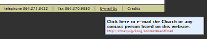
- Bottom navigation looks like the top navigation, but none of these boxes are clickable…oh wait, the sixth one is and gets a popup box–but the credits link next to it doesn’t Maybe the designers felt modest! (They should be proud.)
Conclusion
St. Mary’s of Greenville is a great looking site with a winning design and many elements you’ll want to consider for your parish or church website. What lesson did you learn?
![]() Like this post? Subscribe to the feed.
Like this post? Subscribe to the feed.
More Reviews »

Technorati tags: site review, st mary greenville, stmarysgvl.org

Thank you for all you wonderful words concerning the St. Mary’s website that I re-designed and constructed on my own last summer.
I will look into allowing for text size adjustments; you are the first of our many visitors to make such a request but it is a good one. When I get a free moment or two I’ll work on building this into the site.
My main reason for posting a reply is to address you gripe concerning only a PDF version of our entire bulletin on-line. I feel that I need to clarify why we do what we do at St. Mary’s of Greenville, SC so that your readers understand our decision. Three years ago we used to post the entire bulletin on-line in HTML. However, this process was time consuming and the main people who maintain the site were getting cramped for time. Thus, I compromised with them and we decided to post the HTML and PDF version for one year and track both using a web analyzing program. At the end of the year it was unanimous that our faithful visitors preferred PDFs over the HTML version ten to one. Thus, we decided to do away with the HTML version of the bulletin so that we could focus on keeping other parts of the site up-to-date and free up some of the weekly maintenance. I hope that sheds some light on why we do what we do. Lastly, I always use web analytic software to help make judgment calls for any website and encourage others to do so as well. I understand that while our visitors do not prefer an HTML bulletin other parishes could have visitors that do.
Again, thank you for your kind words and we’ll take your review into consideration as we move forward with our site to help make it a better experience for all visitors to our on-line home.
Best Regards,
Nate Hanna
Nate,
Thank you for the thoughtful response. Testing with your users and making data-driven decisions is a smart way to go. Keep up the terrific work you’re doing at St. Mary’s.
At my parish, we tried the dual HTML and PDF options long ago, with HTML winning out.
Anyone else out there care to share their experience offering PDF and/or HTML versions of their bulletins or newsletters?
if st marys is so pdf happy, why not make the whole site a bunch of pdfs?
Who knows, maybe Adobe has a satellite office nearby?!
If you put up a page with two columns of links–one HTML and one PDF–and the HTML pages try to mimic a multi-column printout with unusual fonts, then PDFs might be a popular choice. Using a redirect, though, clicking on “bulletins” should lead to a cleanly formatted HTML page with the latest bulletin rather than a calendar of links. At this point you’ve saved users a click and they can immediately start reading. Now they don’t have to even worry about which format to click.
Gerry McGovern chimes in on PDFs, too:
http://newsweaver.ie/gerrymcgovern/e_article000744072.cfm
[…] been a busy week on this blog for older posts. The latest one getting a spike in traffic is my review of St. Mary’s of Greenville, SC. As I type this, the St. Mary’s site is unavailable. If you are looking for more information […]
Is the fire escape a balcony? ,