New Year Checklist for a Good Looking Church Website

8 Quick Fixes to Start Your Year Right

You know the gyms are going to be crowded at this time of year, but what kind of shape is your church website? Follow this quick-fix checklist to make sure your parish looks its best before you head out into 2012.

  1. Do you still have Christmas graphics up after the Epiphany? Now’s the time to take them down before you end up looking like that neighbor who leaves Christmas lights up all year.
  2. Has anyone asked any of your Frequently Asked Questions in the past year? Are the answers still accurate? You might want to check the freshness of your “About Us” page, too. (Here are some good About-Us examples from the business world.)
  3.  Is your domain name expiring this year? Renew it before you risk losing your entire site.
  4.  Did you add any new social media accounts in the past year? Make sure all of them are listed on your site and in your marketing materials. Reorder the list if you are more active on some than others. And confirm that you are using consistent imagery and descriptions across all of these networks.
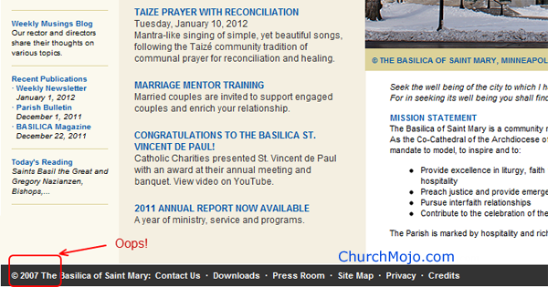
  5. Got the wrong copyright year at the bottom of your website? That’s oh so 2011. Here’s how to fix that problem so your site automatically updates each year. If your site runs on PHP, use this line of code (without the spaces):
    &Copy; Copyright < ? php echo date ( ' Y ' ) ; ? > Your
    Business Name or Site

    This will give you:
    © Copyright 2012 Acme, Inc.

    this year and next year the 2012 will automatically switch to 2013.

    If you don’t have PHP, you’ll need to resort to JavaScript.

    Copyright &Copy; <script type="text/java script">
     document.write(new Date().getFullYear());
     </script> Your Business Name or Site Name

    And remember, you can copyright your content but copyright law doesn’t protect domain names.

  6. Do your “contact us” forms still work? Fill them out, submit and then check that the confirmation message remains relevant and that the message reaches the proper inbox. And if these submissions go to someone other than you, it’s a good opportunity to see how fast your parish staff or designated volunteer replies.
  7. Repeat step 6 with your online donations forms. (Actually, that’s a good one to check before the end of the year. Sorry about that!)
  8.  Did any of your parish policies change, such as how you register as a parishioner or timelines for wedding and baptism preparations? Update your site and remind your staff accordingly.

Those are some key items to get you started on reviewing your parish website. So, what are you doing for your church to look good in the new year?

(Note: I wrote a small business-focused version of this article for NFIB that appeared as New Year Checklist for a Good Looking Small Business)

Examples of Copyright Dates on Church Websites
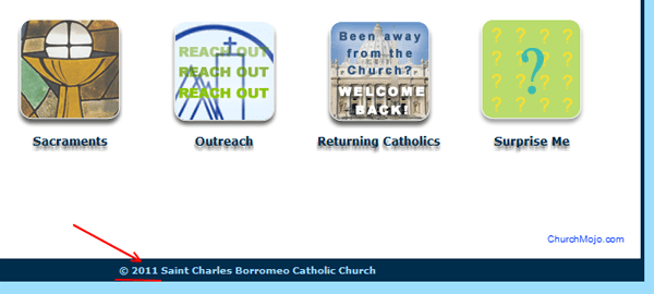
Example of StCharlesChurch.org with the wrong year on home page
Wrong year on StCharlesChurch.org
StJohnsTipton.com doesn't use a year in its copyright notice.
StJohnsTipton.com avoids the issue by not putting a year in its copyright notice.
Mary.org's great site needs to fix that 2007 copyright date.
SMIP.org shows 2011 in January 2012
CrossintheWoods.com shows the previous year's date.

Take a Page from St. Mary’s of Greenville, SC

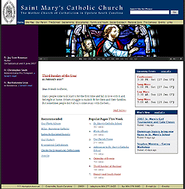
St. Mary’s home page
Update: November 15: St. Mary’s site is restored 

See this post for related coverage.

Update: November 14, 2008, 10:37 PM ET.
The St. Mary’s of Greenville site is unavailable as I write this so many of you are coming here looking for more information. Try these links:

I’m guessing St. Mary’s site is unavailable due to a surge in traffic, but I have not yet heard back from one of my webmaster contacts there.
Thank you–Mark
[Update from Nov. 15, 2008: Port 80 was closed intentionally to give time for the Diocese to regroup.] 

OK, back to the original review from January of 2007…

You don’t have to wonder this month why , South Carolina is American Catholic’s website of the month. One look at this site’s beautiful layout and gorgeous pictures will inspire you to explore the clearly displayed main content areas and to read the fresh news. Let’s take a closer look at the many elements of church site design St. Mary’s does right that you may want to try on your own site.

Continue reading

Take a Page From St. Jerome’s Church in St. Petersburg

You can see how your church website compares to others by taking a look at American Catholic’s Parish Site of the Month, which I do each month. While American Catholic doesn’t share the criteria they used to select St. Jerome’s in Petersburg in December, here are a few features that stand out.
Continue reading

Take a Page From St. John’s-St. Ann’s in Albany

You can see how your church website compares to others by taking a look at American Catholic’s Parish Site of the Month. While American Catholic doesn’t share the criteria they used to select St. John’s-St. Ann’s of Albany in November, here are a few features that stand out.

  • People pictures, not empty building pictures – The Church is the people, right? Then how come so many sites limit their photos to building exteriors or empty interiors? Sts. J-A gets it right by showing the choir and other volunteers in action on the homepage. You’ll also find shots of the property, too, so that newcomers can find it in person.
  • Clearly set the tone of the parish on the home page – A prominent outreach link and an Iraq War Body Count banner let you know what this parish is about up front. Newcomers or church shoppers don’t have to guess what’s important to this parish.
  • Timely homepage – Current readings and an acknowledgement of the Site of the Month designation reassure visitors that this is an active and worthwhile site. Including some key parish events here would further reinforce this impression.

This is a site that’s doing a lot of the right things. In a few areas, though, the content looks like it’s not quire ready to go “live”. The calendar points to an unbranded, separate .mac account that lists but one event for November and none for December. Better to stick with the established announcements page or use a regular page on the site. The placeholder “cemetery (coming soon)” navigation link would be frustrating to someone who just experienced a loved one’s death. Just link to contact information or leave out the link until the content is ready. And once you get beyond the homepage, the title tags no longer reference the church’s name, such as “Liturgical Ministries” or “Join Our Parish,” which begs the question which parish? if you’re relying on that snippet in your bookmarks or search engine results. I’d also love to see a couple of staples from other church sites: a site-specific search engine and weekly Sunday bulletins, but the site has so much else going for it.

So what lessons did you learn from the terrific St. John’s and St. Ann’s site?