Study: Introductory Paragraphs and Tabs Don’t Aid Reading Comprehension Online

Resource Shelf noted a study today about the effects of Web document formatting on user comprehension and behavior (PDF). The University of Washington researchers recreated several different versions of an information site, with one set lacking global navigation (Figure 1 below) and another having tabbed navigation (Figure 2). Other variations included no introductory text (1A, 2A), introductory text followed by bulleted categories (1B, 2B) and introductory text with embedded links (1C, 2C).

Variations of Big Bend Test Pages
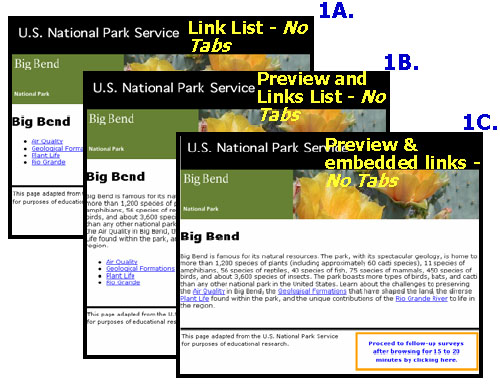
Figure 1: Three variations of pages without global navigation.

Variations of Big Bend Test Pages With Tabbed Navigation
Figure 2: Three variations of pages containing tabbed navigation.

Some of the findings of how presentation influences reader behavior surprised the researchers:

  • Introductory text (B) without embedded links doesn’t increase factual comprehension; nor does it increase total time spent on site
  • Tabbed navigation (figure 2) doesn’t influence comprehension of the material, but it does encourage site exploration and increases user satisfaction.
  • Introductory text with embedded links (C) increases referential comprehension (understanding how the material relates to other topics), but at the cost of severely reducing satisfaction-particularly in the absence of tabbed navigation (1C vs 2C)
  • Link lists without introductions (1A, 2A) generate more page views than link lists with introductions (1B, 2B).
  • Tabbed navigation (figure 2) increases the number of pages viewed. While not mentioned in the study, there’s likely an upper limit to how many navigational tabs you can add before this works against you. Just ask Amazon.

So, users like tabs (no surprise), but that introductory text isn’t necessarily going to help comprehension (surprise). Embedded anchor text is good for SEO and reader comprehension, but bad for reader satisfaction. As the abstract states, “structural cues that promote understanding are not necessarily those that promote exploration or enjoyment.” Choose wisely.

Kathryn A. Mobrand, Elisabeth Cuddihy, Edward Galore and Jan H. Spyridakis from the University of Washington published The Effect of Structural Cues on User Comprehension, Navigational Behavior, and Perceptions. Their study involved 282 engineering undergrads from UWA who reviewed Web sites based on the U.S. National Park Service Web site for Big Bend National Park in Texas.

Advertisement

Jakob Nielsen is Looking for Church Redesign Case Studies

My inbox included the fortnightly reminder that a new Alertbox from usability guru Jakob Nielsen was online. The message also contained a request for case studies about measurable impacts of website design changes for an upcoming study. If you’ve redesigned your church’s site and have some metrics to back it up, send your data, before- and after-screenshots, and a brief explanation of the work to John Berger, metrics@nngroup.com, of the Nielsen/Norman Group. All contributors get a copy of the final study.

Possible metrics can show improvement or deterioration in areas such as:

  • Sign-up rate for newsletters
  • Conversion rates
  • Training time needed to learn a feature or system
  • Time on task and other productivity measures
  • Percentage of users who abandon a process at a particular step

You can remain anonymous in the final study if you’d like, but where’s the fun in that? The study isn’t limited to church redesigns. In fact, your entry might be the sole church featured. So, if you have some good examples then take the opportunity to contribute to the usability community and get some publicity for your parish.

Don’t Assume Users Know Logo = Home Button

While doing some B2B usability testing, it became clear that some users weren’t aware of the common design practice that clicking on the company logo in the corner will take you back to the home page. The same probably applies to your church website’s navigation. Consider adding an explicit link to your home page within the navigation. Just don’t make it active on the home page itself, of course.

Trutech T600-D DVD Player Doesn’t Work

Thinking about buying a cheap DVD unit for the church youth room? Skip the Trutech T600-D DVD player unless you don’t mind a device that can’t handle DVD menus, pixelates the picture during scene changes and generally strains to keep up with video.

For $27 I wasn’t expecting much, but at least expected playback to function reasonably well. I was using the S-video connection and tried legitmate DVDs, including Life Is Beautiful (one of my all-time faves), the first Lord of the Rings, a random Rescue Heroes and a Disney promotional DVD about planning a trip to the Magic Kingdom (my kids love this one). In each case, the video would stutter at least every couple of minutes and often had difficulty handling menus.

I liked the price and narrow size because it could squeeze into my existing cabinet, but it looks like a return to Target and some more research.